Overview
A café with zero digital presence. A manager with a revenue goal. A 30% catering target to hit.
Audrey's is a student-run coffee shop inside Geisel Library serving two different audiences—students and business catering clients. As UX/UI Designer, I was responsible for the end-to-end design process including reworking the information architecture, building a design system, and developing content strategy to communicate clearly to both audiences. I worked closely with the Operations Manager to align business goals and resolve accessibility issues.
The Problem
Although Audrey's is patroned by hundreds of customers a week, the coffee shop has no dedicated website other than a small description on the Geisel Library website. Students need a mobile-first menu for deliberate caffeine-boost searching. Meanwhile, the manager wanted to scale catering orders to 30% of the café's profits.
The Solution
My challenge was to establish a digital identity for Audrey’s by developing a mobile-optimized platform that streamlines the customer experience and accelerates B2B revenue, all while working within UC San Diego's design system. The end result was a seamless and user-friendly design, ensuring a cohesive experience across all platforms.
Research
Client Meeting
I started the design process by interviewing Audrey's manager, Brianna, to determine what they were looking for in a website. These were the main takeways:
- Revenue Optimization: Creating a professional catering portal to transition the café’s profit model toward a 30% catering-based revenue stream.
- Menu Overhaul: Brianna explained that the current menu is a mess. Customers can't find what they're looking for because there are too many options. It need to be restructured into an intuitive, scannable interface that reduces cognitive load for busy students.
- Seuss Style: Because the café and library are inspired by Dr. Seuss, it should combine his aesthetics with Audrey's daisy logo and color palette.
User Interviews
Typical customers are undergraduates cramming at Geisel who need to grab a quick snack without leaving the building. In fact, the café's highest sales happen during Finals week, when the library stays open until midnight and espresso demand peaks. Across 10 interviews, here are three insights that shaped my design decisions:
- Mobile-First is Mandatory: Every user owned a smartphone and over half used it to study at least once a week. A desktop-only site would miss the majority of customers.
- Price Sensitivity: Most customers are on a tight budget and don't like spending more than $3. Price visibility and menu scannability aren't just UX nice-to-haves — they're the difference between a sale and a bounce.
- Speed Over Exploration: Students aren't browsing, they're on a caffeine mission with a paper due in two hours. The design needed to get them in and back to studying as fast as possible.


10 interviews consolidated into 2 user personas
Card Sorting
Through this exercise, I realized the menu would be less cluttered by giving teas and lattes their own separate categories, rather than being under hot beverages and coffee. Users wanted the menu reorganized by price in order to make it more scannable, especially for those on a budget. The results helped me gain clarity on Audrey's new menu and sitemap later on, and ensured that the information architecture would match users' expectations.
Competitive Analysis
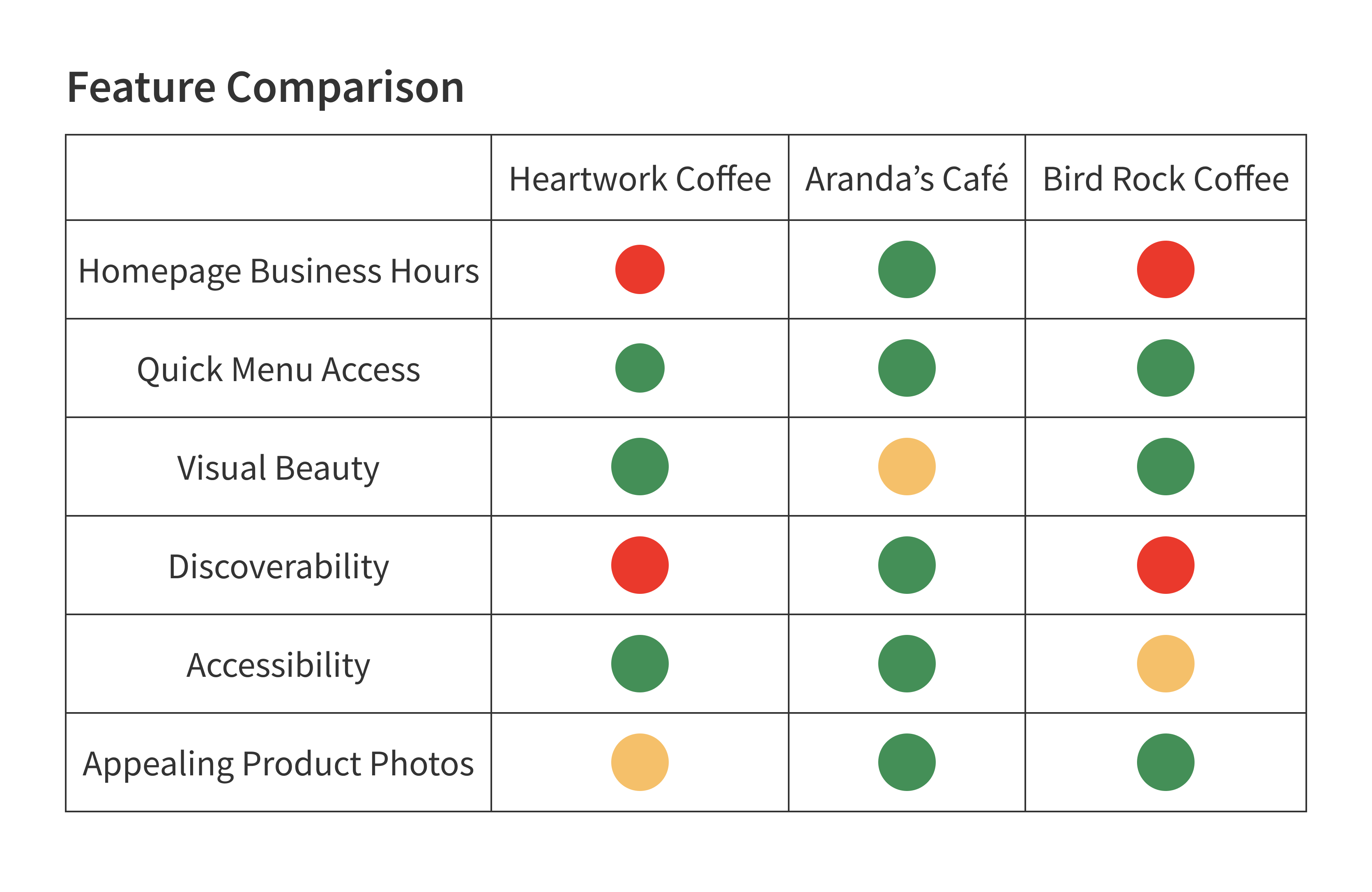
Since I didn't have an existing design to improve upon, I referenced three local websites: Heartwork Coffee, Arandas Café, and Bird Rock Coffee Roasters. I paid close attention to site architecture, usability, and visual design especially for the mobile versions. 2 out of 3 competitors buried their business hours. For a café that lives and dies by Finals week foot traffic, this was non-negotiable. Every red zone in my feature comparison became a design requirement for Audrey's—and a mistake to actively avoid.
Heartwork Coffee Bar
Aranda's Café
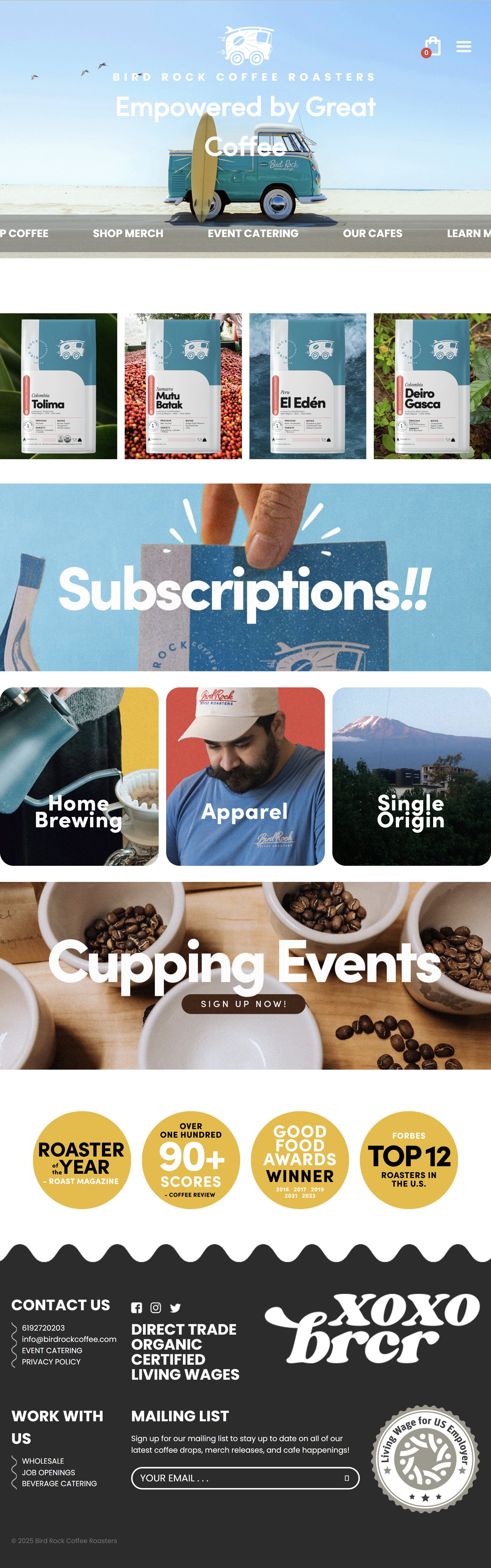
Bird Rock Coffee Roasters
Design
Style Guide
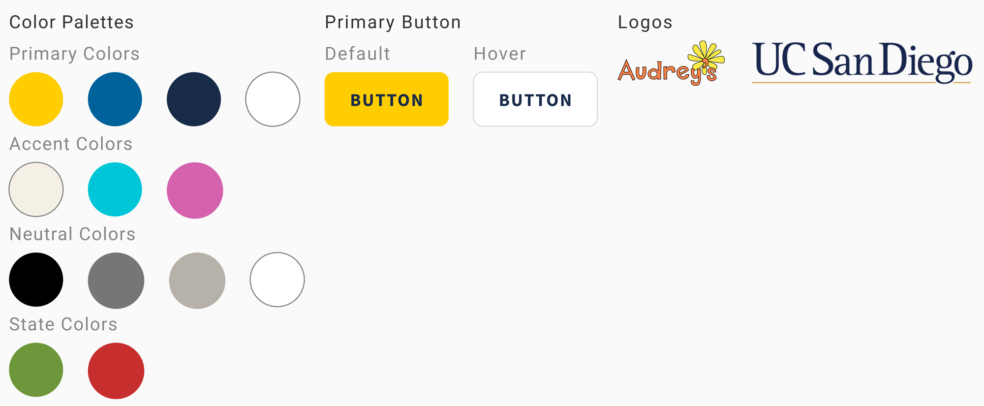
I created a style guide using UCSD's design system to create consistency. Every design decision was a balancing act between the university's brand, WCAG accessibility standards, and the manager's Dr. Seuss vision. Audrey's orange failed accessibility standards so it couldn't be used for text, buttons, or backgrounds. I fixed this issue by introducing UCSD's yellow and navy into the color palette, which satisfied both the brand guidelines and the accessibility requirements while keeping the warm, playful feel the manager wanted.
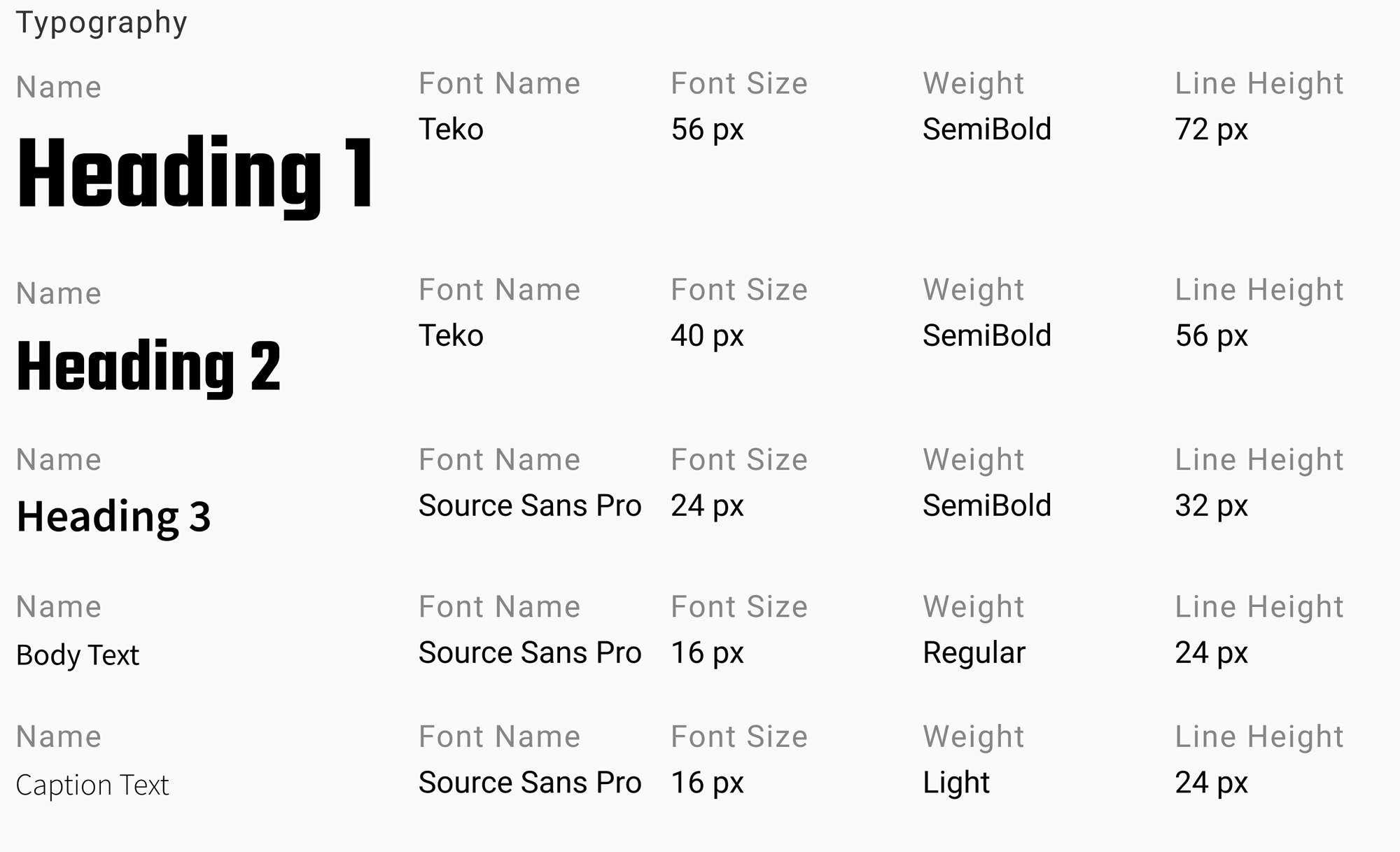
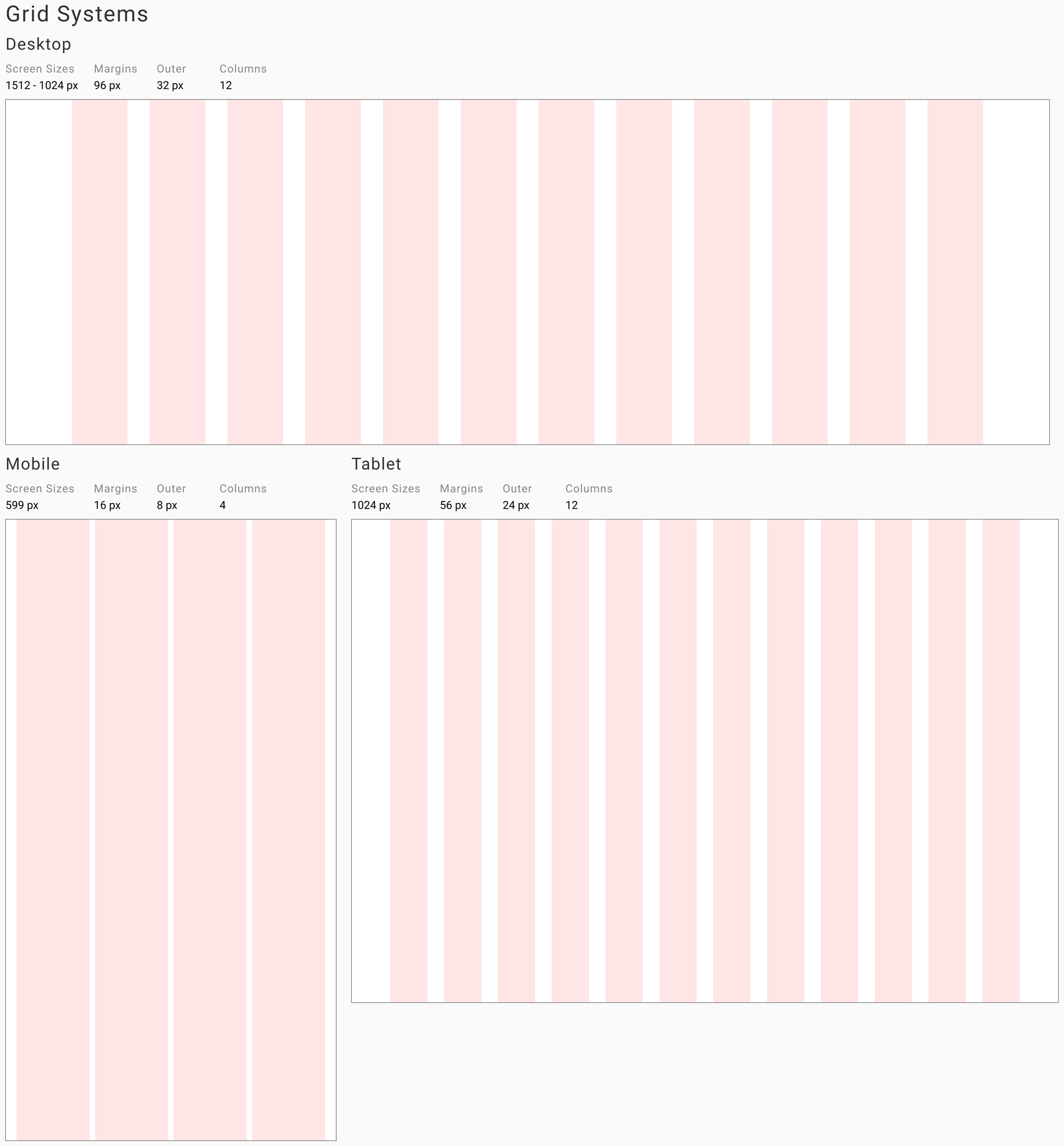
To make sure content layout was standardized across all screens, I created a grid system. Everything from font size, line height to padding is a value divisible by 4.
Low-fidelity Wireframes
Paper prototyping was my first step in generating solutions. Sketching allowed me to think at a high level about organization and user flows. I was able to mockup site content and navigation, especially for the mobile version.
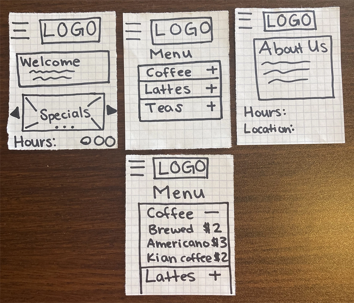
Once I got the manager's approval of the information architecture and design system, I created low-fidelity wireframes of some of the key pages of the site.
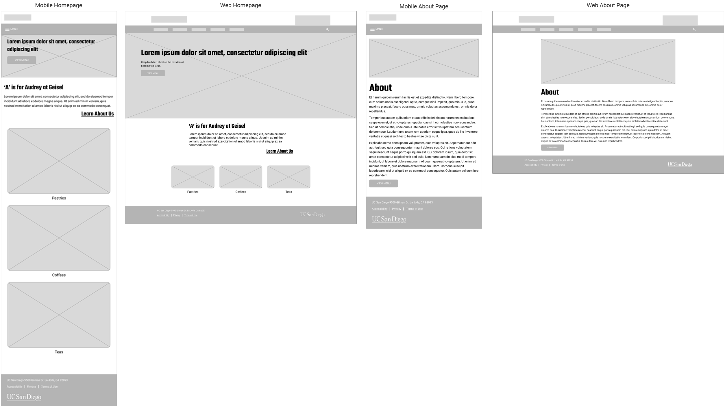
High-fidelity Wireframes
With my design more fleshed out, I moved onto making high-fidelity desktop and mobile mockups.
Note: only select screens are shown
Test
Usability Testing
Finally I could work with end users to test the prototypes. The chart below shows the average time it took thirteen users to complete five tasks:
- Find today's business hours.
- Find a drink under $4 you'd want to purchase.
- You'd like to get catering for March 27 at 10:30am. How much would it cost for 2 airpots of coffee and 3 carafes of iced tea?
- List the 3 quarterly specials.
- Discover the story behind Audrey's.
Users ran into problems clicking the dropdown menu. The mobile dropdown menu only expanded when users clicked on the caret button. Users were tapping on the category names instead. The task completion rate was 90%.

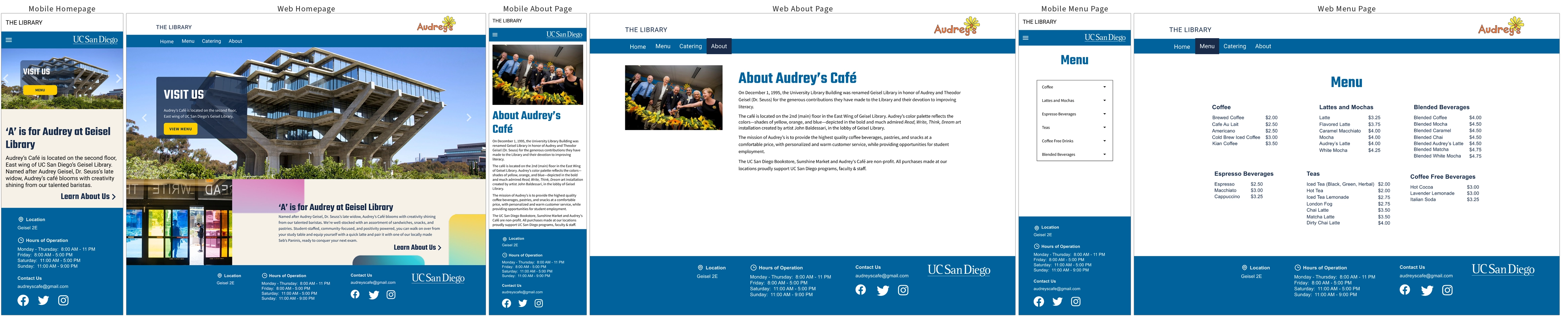
Final Prototype
The catering portal replaced their phone-based ordering system and helped grow catering to 30% of the café's total revenue.
Lessons Learned
The most difficult part of this project was the conversation I kept avoiding. I knew I would have trouble working around Audrey's color palette, but I hesitated telling the manager because 1) it was one of her design requirements and 2) it felt like challenging her vision. I learned that the most effective way to advocate for user-centered design isn't to present a problem, it's to present a better solution in person with context. She got on board immediately.
Balancing stakeholder needs, user needs, accessibility requirements, and a deadline taught me that communication is a design skill. The sooner you surface a constraint, the more options you have to solve it.