Overview
1-star app. 20 A/B tests. 37→80 System Usability Score
The UCSD Mobile Cards app manages everything students need like Triton Cash, Dining Dollars, laundry, food, and more. It's supposed to be the Triton lifeline, but it had a 1-star rating in the App Store. I conducted 20 user interviews, ran statistically significant A/B testing, and redesigned the app from the ground up. The result: a SUS score improvement from 37 to 80.
The Problem
One of the app's core functions, adding funds to a Triton Cash account, requires jumping between 7 separate pages. Half of interviewed users had given up on the app entirely, using it only to check their dining balance—nothing else.
The Solution
I simplified the user flow, rebuilt the information architecture, and redesigned the interface to meet WCAG accessibility standards. The goal: make the app actually work for the students who depend on it every day.
Research
User Interviews
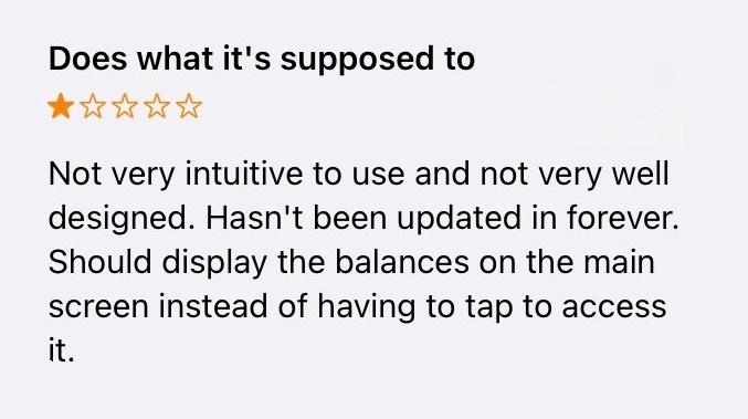
An example of a 1-star review in the App Store.
I conducted 20 in-depth interviews, combining observation with open-ended questions and timed task completion. I learned users have 2 main goals: check their balance and add money for laundry.
- Abandoned Functionality: 50% of users only used the app to check their dining balance. The app's other features were effectively invisible.
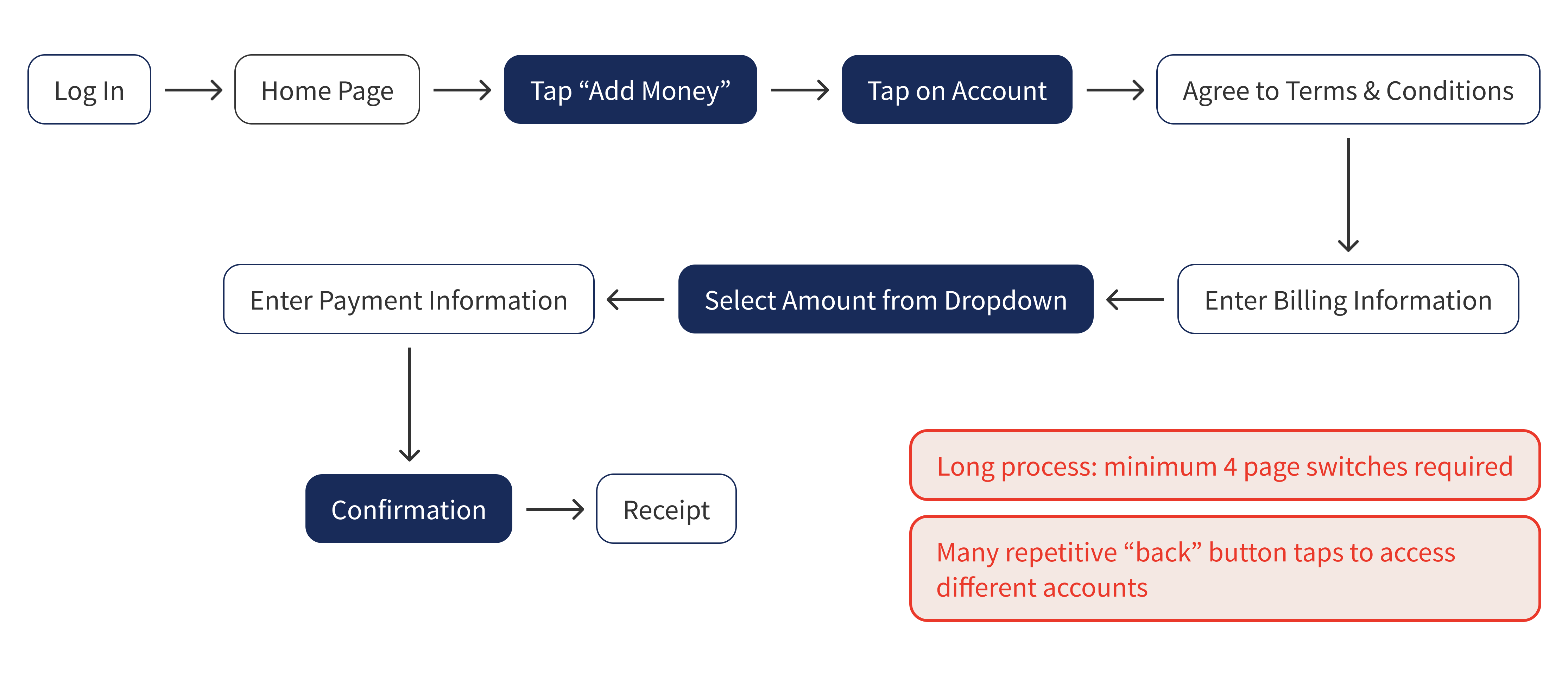
- Deposit Friction: Making a deposit required navigating through 7 separate pages.
- Poor Usability Score: The SUS score of the current design was 37/100, considered poor usability.
Users also consistently asked for easier access to recent transactions. View the complete interview data here.
Problematic User Flow
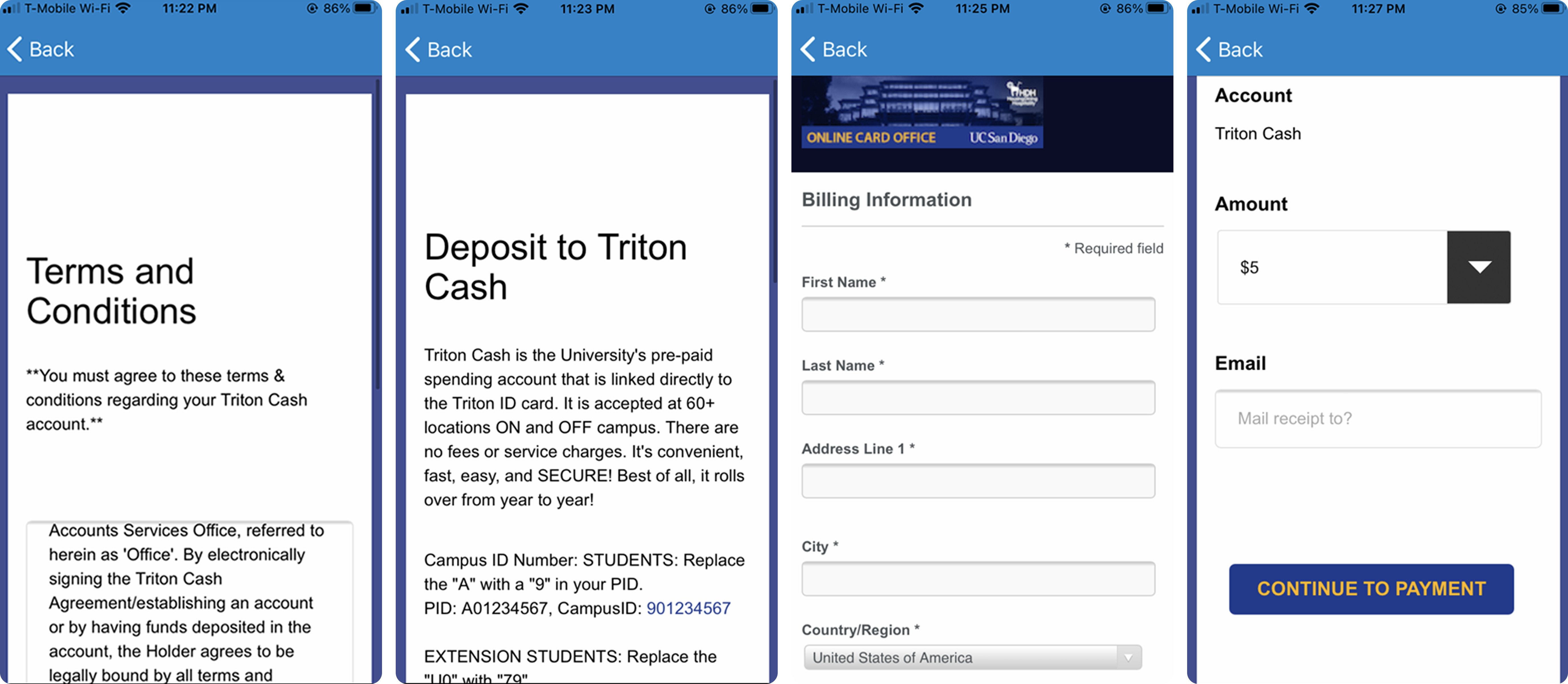
A few screenshots of the deposit process.
The current deposit flow is unnecessarily long. Adding funds to an account requires users to move between 7 pages.
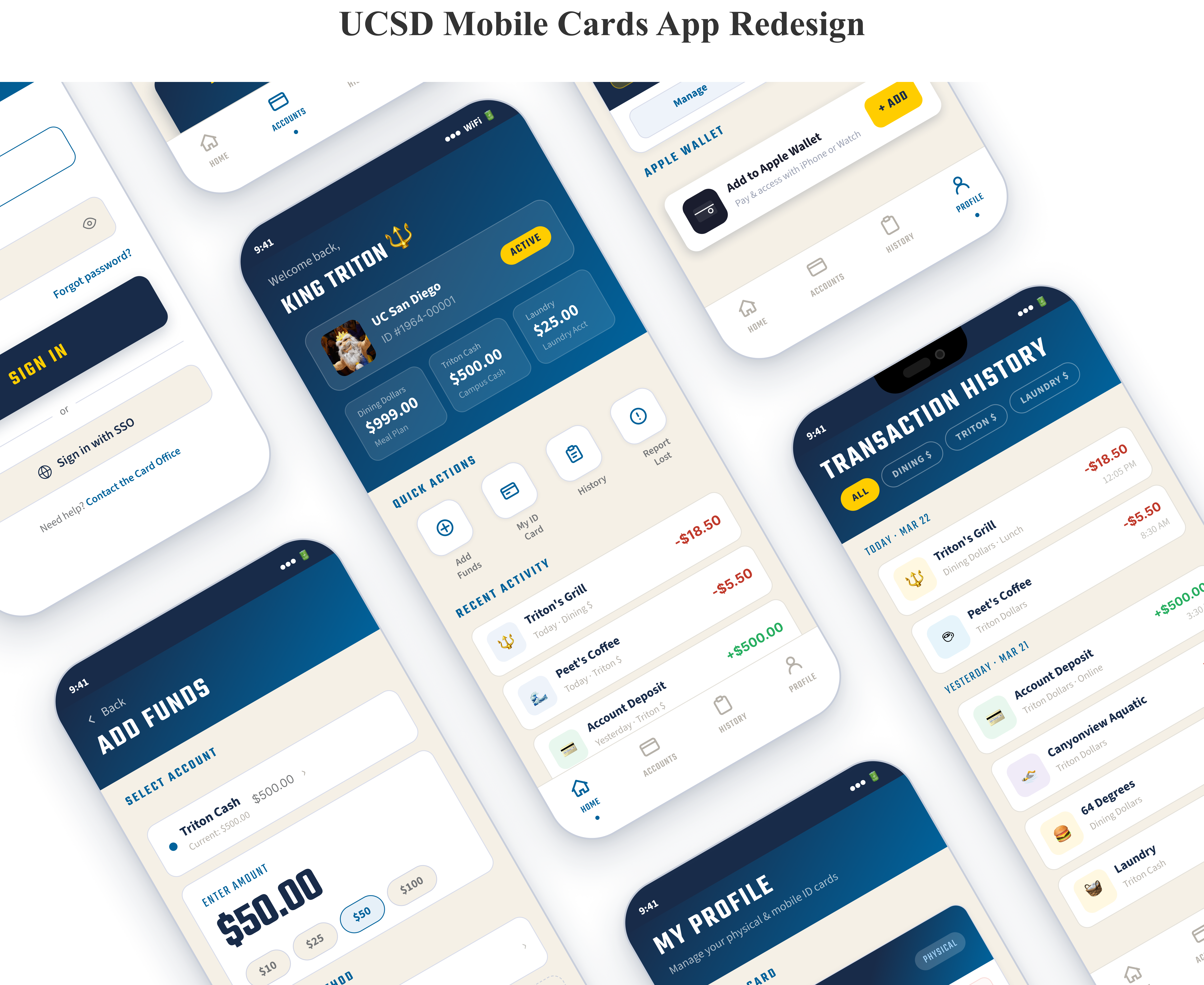
Design Decisions: Before & After
The existing app fails many of Nielsen's 10 usability heuristics. When an application follows established standards, users know what to expect, learnability is increased, and confusion is reduced. Every design decision traces back to a heuristic violation or interview finding. Below are the most critical screens.
Login Screen
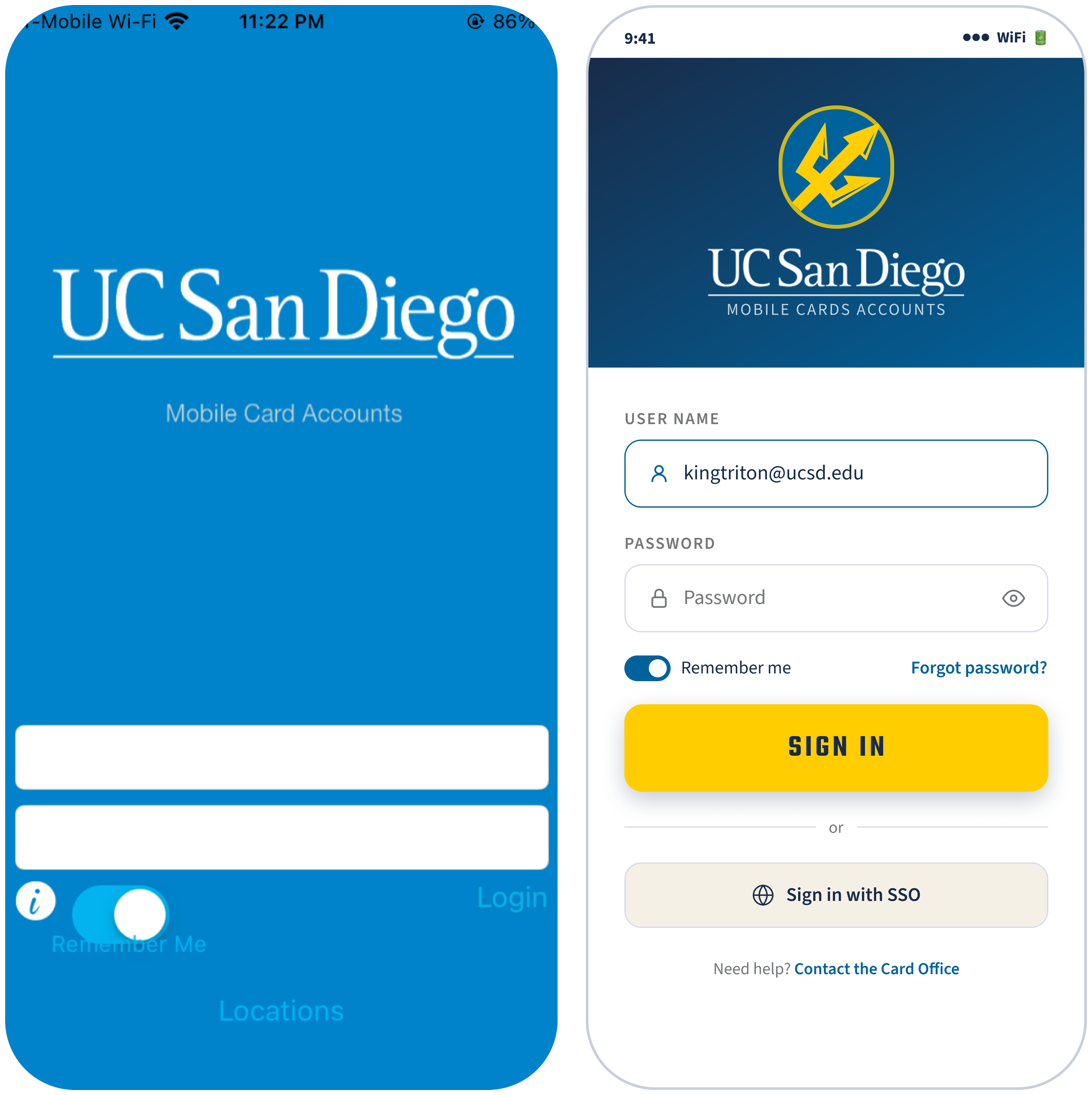
- Consistency and Standards: "Login" was just a plain text link. The redesign uses a design system to maintain the same typography, color palette, and components.
- Accessible Colors: "Remember Me" and "Locations" were invisible against the blue background. All text in the new design meets WCAG 4.5:1 contrast requirements.
Home Screen
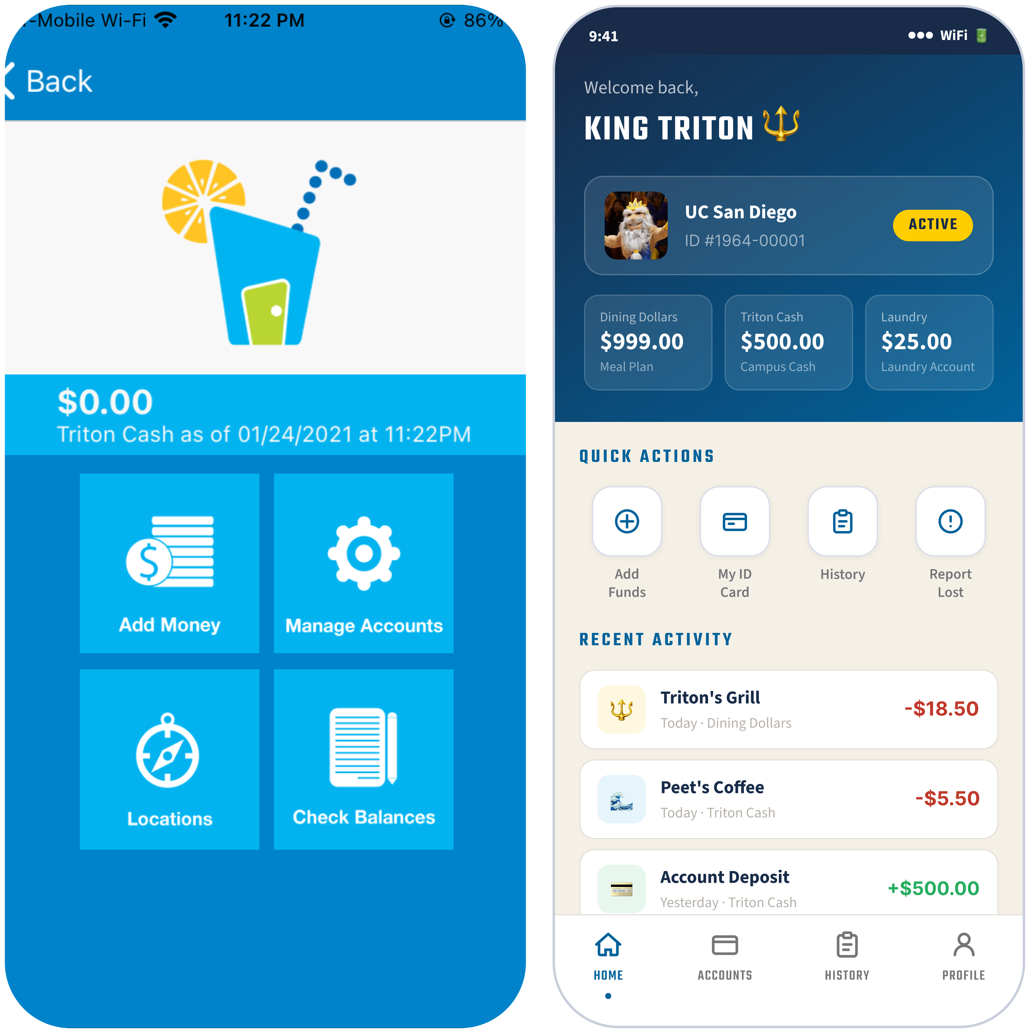
- Visibility of System Status: Only one balance was visible at a time, making users to jump around via the "back" button to see the others. The redesign displays all 3 balances the moment you log in.
- Flexibility and Efficiency of Use: Checking a different balance required tapping "Check Balances", navigating away, then hitting back—repeat for each account. Recent Activity brings transaction history to the home screen, eliminating the need to hunt for it.
- Consistency and Standards: The original's navigation is a 2×2 grid of giant blue squares. Quick Actions replace them with differentiated icons and a persistent bottom navigation replaces back-button dependency.
Deposit Screen
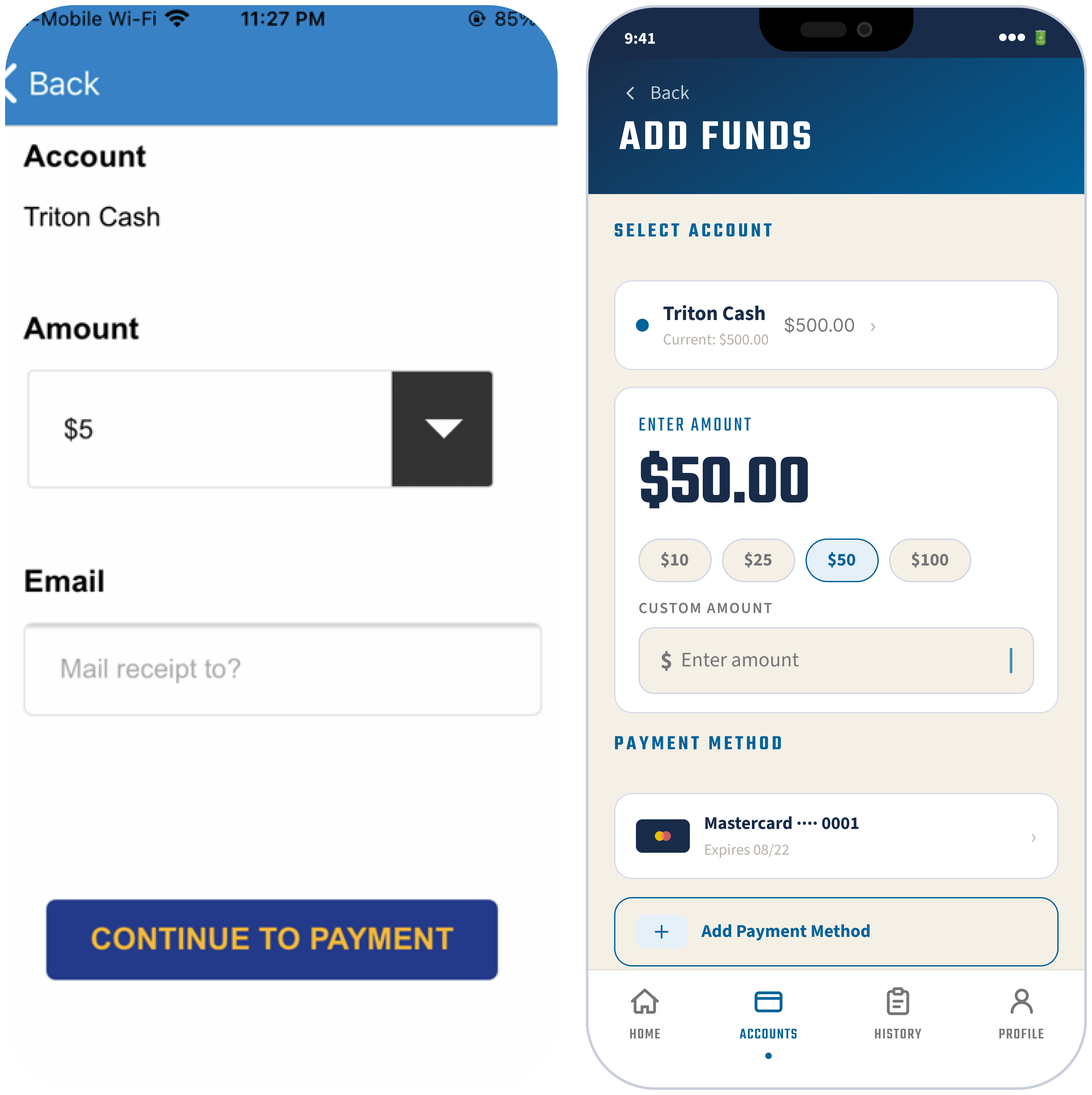
- Flexibility and Efficiency of Use: Making a deposit required 7 separate screens. The redesign consolidates everything (account selector, amount, custom input, and saved payment method) onto one screen. A floating action button (FAB) makes the most-used action available without navigating away.
- Recognition Rather Than Recall: The original required a full billing address form on every deposit. The redesign saves payment methods so returning users never re-enter their details.
Prototype
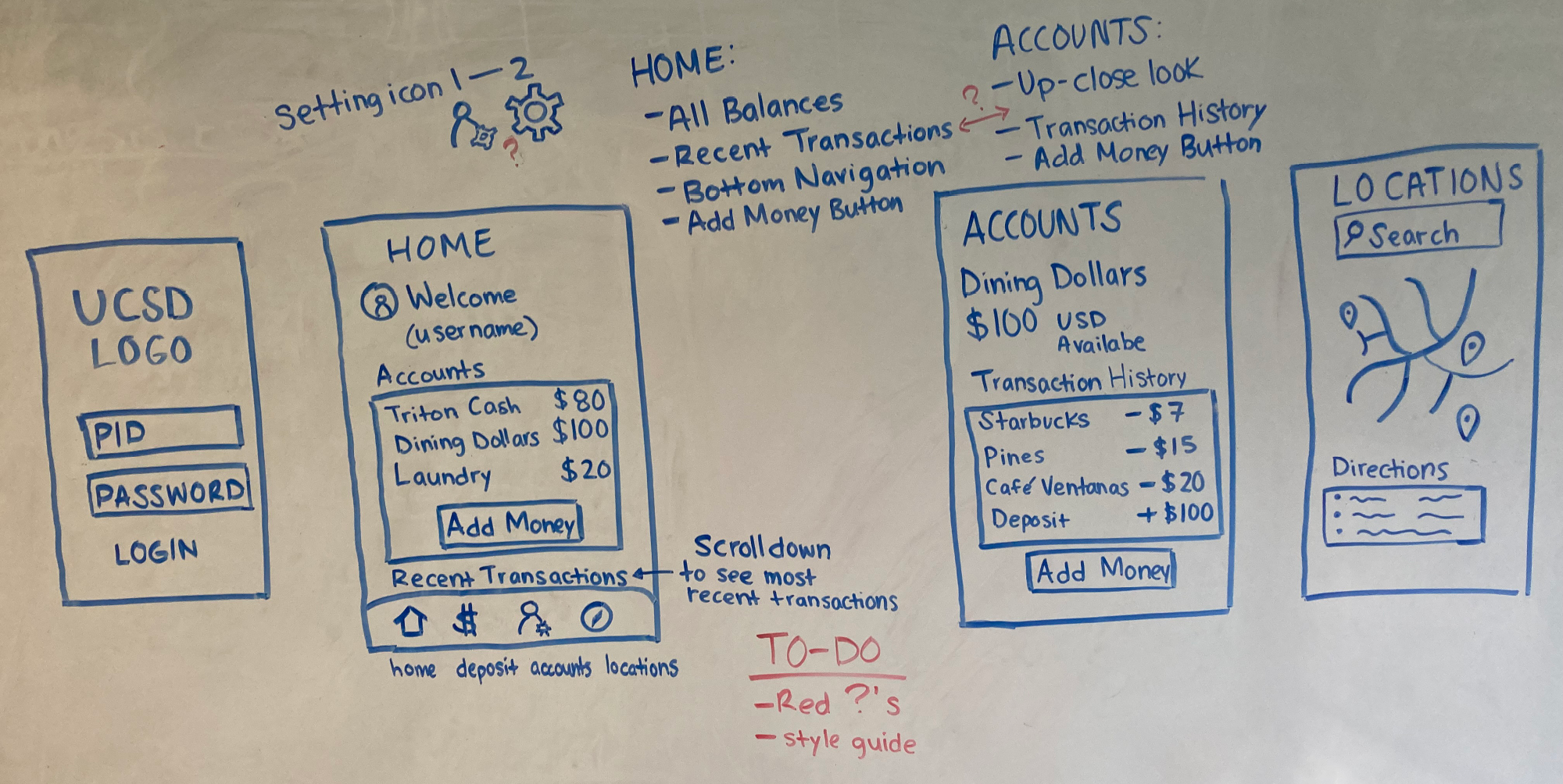
Whiteboard Wireframes
I drafted the first wireframes on a whiteboard. The core decision was combining all account balances onto a single Home screen, eliminating the screen shuffling that frustrated users in the original app. A bottom navigation gives students access to Deposit, Accounts, and Transaction History from anywhere without losing their place.
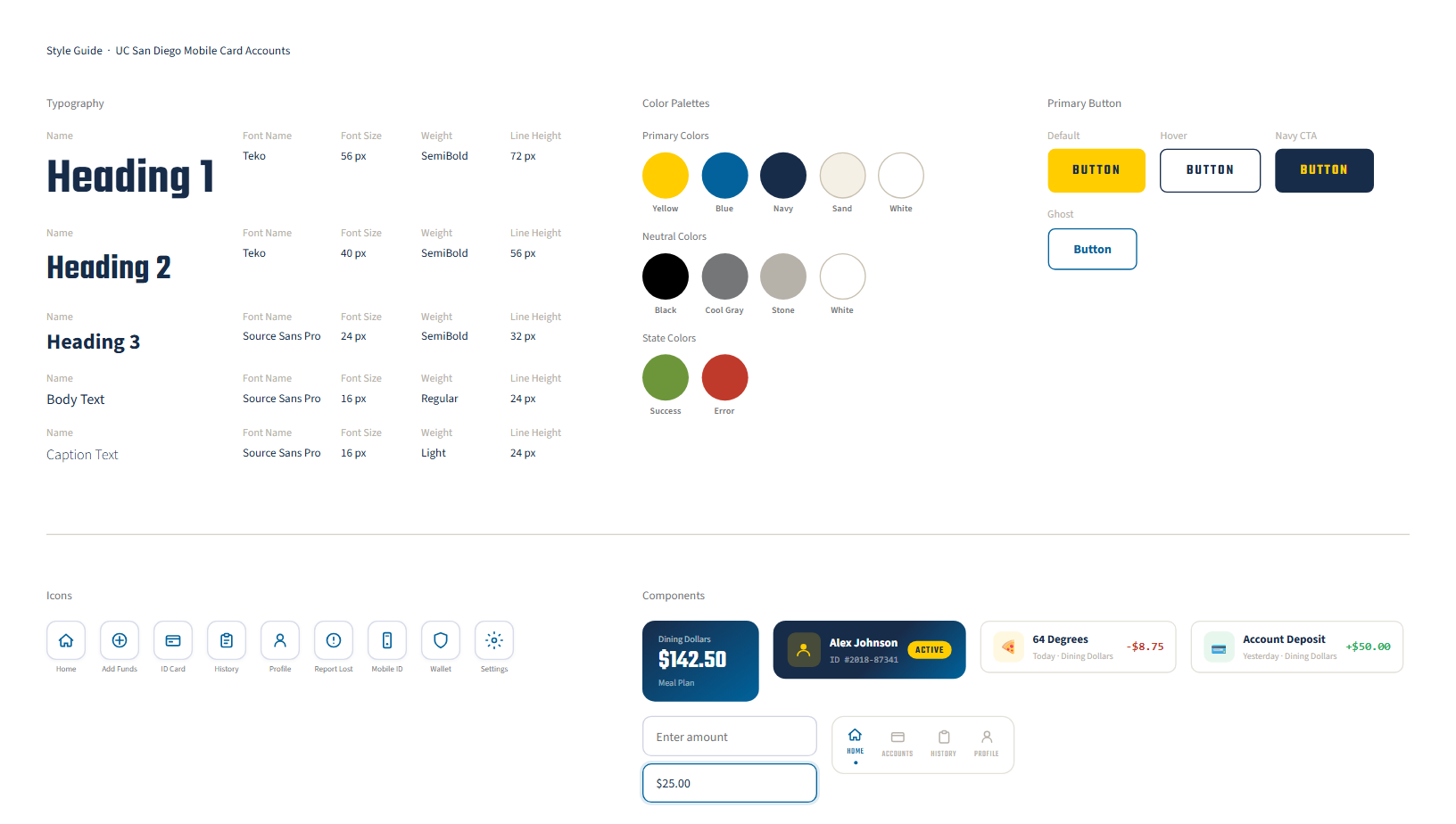
Style Guide
I rebuilt the design system from scratch—replacing the flat blue palette with UCSD's official brand colors, establishing a type hierarchy using Teko and Source Sans, and standardizing the button system. Every color combination meets WCAG 4.5:1 contrast requirements.
Test
A/B Testing
I ran 20 A/B tests measuring user preference for making deposits. A is the current system (control) and B is my revamped design (variant). Users who saw the control had a conversion rate of 10%, and the other users who saw the variant had a 35% conversion rate. With a 95% statistical significance and p-value of 0.02, I can be confident that variant B is the preferred design. The SUS score for my design was 80/100.
Final Prototype
Lessons Learned

Design decisions need to be evidence-based and validated through user testing—skipping that step is how a 1-star app gets built and stays that way. A 37 SUS score isn't an accident, it's a data point. It's what happens when no one asks users what matters most. The most valuable lesson was learning to let the data speak. Whether or not an organization acts on your recommendations is outside your control.